Development
Why Your Business Needs a Mobile-Friendly Landing Page
Why responsive development matters, how mobile usability affects visitors and what to check before launch.
3 min read
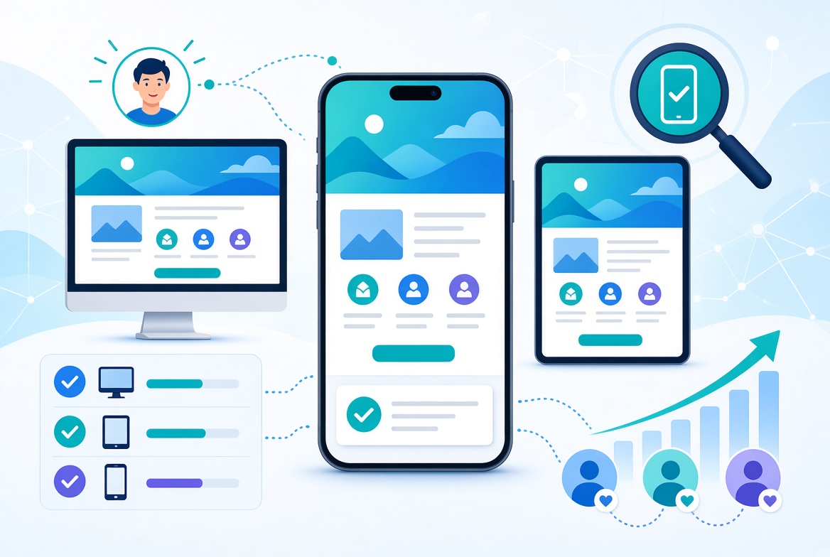
Imagine someone discovers your business through a Google search, social media post or online advertisement. They click your link using their phone, but the landing page is difficult to read, the buttons are too small and the contact form is frustrating to complete.
What happens next? They may leave without contacting you.
A mobile-friendly landing page is not just a design preference. It's an important part of creating a usable experience for potential customers.
What is a mobile-friendly landing page?
A mobile-friendly landing page is designed and developed to work comfortably on smaller screens.
Its content, images, navigation, buttons and forms adapt to the available screen space.
Rather than simply shrinking a desktop layout, responsive development adjusts how the page is organised and displayed on different devices.
Why does mobile responsiveness matter?
1. Visitors can understand your offer more easily
Your headline, product benefits and calls to action should remain clear on smaller screens.
If visitors have to zoom in or struggle to read the content, they may not understand what your business offers.
2. Forms become easier to complete
Forms are often an important part of lead generation landing pages.
On mobile, input fields should be easy to tap, labels should be readable and the form should avoid unnecessary steps.
3. Calls to action remain accessible
Whether you want visitors to book a consultation, request a quote or start a free trial, your main action should be easy to find and use.
Buttons need sufficient size and spacing to work comfortably with touch interaction.
4. Product images and content display properly
Large screenshots, illustrations and multi-column layouts often need adjustments for mobile.
A good responsive implementation makes sure visual elements support the message without overwhelming the screen or slowing down the page.
5. Mobile usability supports search performance
Google primarily uses the mobile version of website content for indexing. A page that has missing or inaccessible content on mobile can create search visibility problems.
Mobile usability should therefore be considered during both development and SEO preparation.
What should you check before launching a mobile landing page?
Review these essential elements:
- Is the main headline readable without zooming?
- Does the navigation work on mobile?
- Are buttons easy to tap?
- Are forms simple to complete?
- Do images fit the screen?
- Is the page free from horizontal scrolling?
- Does the page load efficiently?
- Are important sections and links available on mobile?
Testing on actual devices, where possible, is useful because browser resizing alone may not reveal every usability issue.
Responsive landing page development with Next.js and React
A responsive landing page requires more than a few CSS adjustments.
The developer needs to consider layout behaviour, typography, image sizing, component structure and interaction across screen sizes.
Using technologies such as React, Next.js and Tailwind CSS, I build responsive page components that adapt to different devices while keeping the experience consistent.
The technology is only part of the process. The important outcome is a landing page that visitors can understand and use.
Need a responsive landing page for your business?
I develop custom landing pages for startups, SaaS companies and small businesses, with responsive layouts, performance and usability considered from the beginning.
Discuss your landing page project and let's build a page that works across devices.
Learn more about my landing page development service or see recent projects.